Monday, April 28, 2014

Stepping Out Of My Comfort Zone!

So a new challenge came out at Mo's Digital Pencil Blog, to create a CAS card... I personally didn't know what CAS meant, and found out it meant 'Clean And Simple'. Usually I struggle and strain and come up with ideas for cards. I LOVE painting and colouring, but I really struggle designing cards, but this one idea just JUMPED out at me!!! and it would be PERFECT for this challenge.

The other day I bought a new set of papers from KMART, and it had a 6x6inch paper with the loveliest wood panel across it. I have a real thing for wood, and just HAD to have it when I saw the paper, plus I had the PERFECT stamp to go with it.

As soon as I got home I went through my stamps and got out the one stamp I had in my mind 'A Little Bird Told Me'  Designed by Mo Manning and can be purchased as a digital HERE or as rubber HERE.  It's such a delightful little girl leaning out a wooden framed window, talking to a bird. How much more perfect could it be for the wooden panel paper I had!!!  The paper could look like the house, with the wooden frames window on it!! Was what I saw in my head! Now just to colour it!

I decided to step out of my comfort zone and colour the image in Copics instead of distressed inks. Now I've had my Copics since the end of February and haven't had a lot of practice, and the stuff I have managed to do, well most of it has been really good flukes!!! So of course when I sit down to ACTUALLY do a project using my Copics, This is when I can't bleepin well use them or get them to work right!! LOL.. but it's all about practice right. :/

I spent the day working with my Copics, trying to get them to work and blend AND be happy with the result... and I came to 3 conclusions by the end of the day...

1. I can throw Copics a very long distance!!! :)

2. This 'Little Bird Told Me' is being painted in distressed inks!!! LOL

3. and my son is now buying me a Skin And Hair class in Copics for my Mothers Day Present!!!

:)

So I thought I'd share with you my disasters!! I mean...works of ART!! :/


Well a second day of painting and crafting and wrestling with my paper trimmer that has decided to not cut straight! and TAAADAAAAAAA

One completed CAS card!!!

I would like to enter this card into the
Challenge #228 -Clean and Simple (w/a Mo image) 
at Mo's Digital Challenge Blog.


So while it's great to step out of our comfort zones, I think we also need to know when to admit defeat!! LOL, or at least admit when we have a limited time period on something and unrealistic goals and go back to what we know best... and leave new skills for things where where we have much more time to practice!! ...... and a few lessons might not be a bad idea either! We can't be naturals at every media. Some things just take LOTS of hard work and PRACTICE PRACTICE and practice!!!...... and practice!!!.... :/ 

..........after I collect all my Copics I've thrown around my lounge in frustrations!! LOL


Thanks For popping by and having a look! 

Happy Painting
Xo


Friday, April 25, 2014

OH OH OH I WON!!! Challenge #227 - Perfectly Pinkalicious

Ok.. Well I didn't win.. That was done by random selection. LOL. But even better as far as I'm concerned, I was selected in the TOP 3!!!  YAY!!!!!!!!!!!!!!!!in the Challenge #227 - Perfectly Pinkalicious (w/a Mo image)

This was the very first Blog Challenge I've ever entered and I was very dubious to enter, because I must admit, I'm still not very confident about my painting and card making, especially with how new I am to it! So this is a fabulous result, and a HUGE EGO BOOST!!! like a I 'cannot get my head to fit through the door it has inflated too big' ego boost! LOL...

So seeing I didn't have my blog at that stage, I thought I'd post on here the card I entered to share with you all. You''ll all recognise it, because it makes up part of my page logo!


and of course... what did I win!!!!

RECOGNITION!!!!!!!!!!!!!!!!!!! which is what I wanted... and a CUTE AS badge to put on my blog!!!
and for someone who is as OBSESSED by Mo Manning's stamps as I am, This little badge on my blog means the world to me!!!

There is a very big problem with this whole scenario though......Now that I have experience the joys of winning one little badge!! I WANT MORE!!!!!!!!!!!! LOL... This could get addictive. :/ So onto my next BLOG CHALLENGE!!!

So why don't you pop over to Mo's Digital Pencil Blog, and participate to!!! It's loads of fun, and you too may be lucky enough to win this little badge to be displayed proudly on your blog page!! This weeks Challenge #228 -Clean and Simple (w/a Mo image).

So THANK YOU MO and DESIGN TEAM!!!!
:)

and thank you for stopping by once again!!

Happy crafting!!

Xo


Wednesday, April 23, 2014

Christmas Countdown Calendar Easel Card!!

Yes yes yes!! I know I know... CHRISTMAS!!! you say... well I like to get a head start on these things! LOL and I had an absolutely Scrum-Dili-Umptious Christmas Fairy called Holly!! stamp designed by the talented Mo Manning, which you can from Mo's Digital Pencil as a digi HERE!!!! OR purchase as a Cling rubber stamp by Penny Back from HERE!!! .

So This is my FIRST Easel card and of COURSE I didn't opt for a standard one, but thought I'd go weird and whacky and combine a circular top with a square bottom, however as I wanted the bottom layers papers to be cut into four triangles that fit together like a patch work quilt, I wanted the circular top to be mounted on one of these triangles so when it was laid flat it looked like a solid piece. But when sitting up, all that came up was ONE triangle piece and the circle.. Well I set myself a difficult challenge!! that really pressed the old nogging to the max.. but with printer paper and lots of fudging around I got it to work.

The idea behind this card is that it forms a Christmas Countdown Calendar! Each December when I set up the decoration for the house, this card will also come out, and as the days pass in December my son and I will be able to cross off the days of December till Christmas. I have stuck the calendar on with brads so that each year the calendar can be replaced with the new year that I print out.
Included with the calendar is a Christmas Wish List gift tag in which my son can write his Christmas wishes on for 'Santa' to find. :)

The Poinsettia's on the card are my own creations made from using the leaves of the Spellbinders "Bitty Blossom" die set to make the flowers. I will put together a tutorial later on for anyone interested in learning how to make these beautiful flowers. I think they turned out really well!

The Christmas Fairy Holly has been painted in Distressed Reinkers.

This card is being entered in the Bella and Bronte Clubhouse April Showcase "Challenge".

Thanks for taking a peak today!!

Xo

Amanda


Saturday, April 19, 2014

TUTORIAL: (Updated)!! How To Tranform A Digi Into Greytones Using Photoshop CS2

*UPDATE!!! In playing around with photoshop I have been able to complete the same process while removing two of my former steps... this post has now been updated to reflect these changes!!! There is NO NEED to change your image from RGB to Greyscale!!!*
----------------------------------------------------------------------------------------------------------------------------


Hi there again!! After such a wonderful response to my tutorial "How To Tranform A Digi Into Sepia Or GreyTones Using Microsoft Word 2010" I posted the other day, I had quite a few questions asked about using other programs, such as Photoshop... so here it goes... a tutorial for Photoshop CS2
Now I know Photoshop CS2 is an old version but since I'm working with quite basic things I'm going to assume the steps will be similar in each version, however feel free to drop me a line if I'm wrong!

Regarding Photoshop... Adobe Photoshop is basically a program developed for the manipulation of photos. It is professional imaging software and as such there are drawbacks to this program, such as there is no ONE STEP MAGIC BUTTON!!! So unlike my first tutorial, where you just had to know where to look and some instant options became available to you through Microsoft Word that had inbuilt programming into it, doing ALL the work for you, this program has little of these features.

However!!! If you are willing to put the time and energy into learning how to use this program, the things you CAN do with it are AMAZING!!! because of there are so many options and these options are all customisable and nothing is limited by ONE STEP MAGIC BUTTONS!!!  I personally use this program for all of my digi merging, which it is a godsend for, giving me amazing results for the time I put into it. Like any program, once you know the steps, they are easy to replicate.

Now I did have this tutorial combined liked my last with the transforming your digi into sepia as well... but after spending the morning screenshotting it all, and counting it all up!! it's a rather long process combined. Also, unlike my previous tute, these two processes are complete different using this program and require you to alter the digi, so I'll start with greytones... and you can move onto "How to Transform A Digi Into Sepia (And Other Rainbow Colours!!) Using Photoshop CS2) when you have gotten these steps done.

For those of you without Photoshop and wanting to use it, DON'T go out buying the latest version which will literally cost you $700-$1500!!! Adobe have released their original version CS2 (the one I'm using in this tute) as freeware!!! and you can download it HERE!!! This is where I got my copy from, it is a legitimate copy, with the keycode available on the same page to activate the program.

Once again, I will write this tutorial from the point of view that you have NEVER used the program before. This way any newbies can have a crack at it. Feel free to bounce ahead if you know the steps!!!

Ok then.. Happy Learning!!!

Tutorial: How To Transform A Digi Into Greytones Using Photoshop CS2


When you start Photoshop this is how it should look!!

Along the top of the screen is the Main Tabs! To open your digi, you will need to click on File, and then Open, as shown below in the screenshot.

This will open up your computer files where you will access your neatly arranged, alphabetised digi files!!! Pft!! LOL :)
For todays tutorial I'll once again be using our friendly little Gingerbread Man digi designed by Mo Manning which is available for free HERE!! I just love him cause he looks like he's waving at me.. HELLO LITTLE GINGERBREAD MAN!!! *waves at my computer screen* Anyhooo!!!
Select your chosen digi and click on Open!

This is how your screen should look!!! If not.. um... Gremlins have infected your computer and you may want to run away screaming now!!!! LOL... or just go back a few steps to make sure everything was followed correctly. :)

Now this is REALLY IMPORTANT!!! We are about to make changes to your little dude! and we really don't want to mistakenly save over your bought digi so we are going to save a copy and rename him... or her!!

To do this, go to the File Tab at the top of your screen again, and click on 'Save As'.

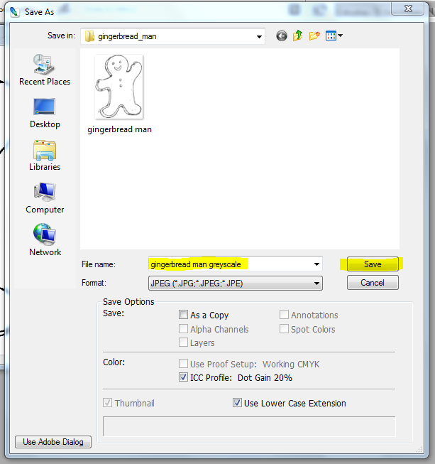
Now you can choose to rename your digi whatever you want, but for ease or use, it is best to rename it something that reflects the changes you are about to make. In our tutorial, we are going to change the digi to greyscale and so if you place your cursor and click in the box with the filename, you can change the name there. I have added greyscale to the original name. you do not need to change any other preferences!! Click 'Save'

 A second box will now open up asking for JPEG Options. You want to make sure that the 'Quality' is set for maximum. you can do this by using the drop down box as highlighted, or by using the slider and moving it to largest file. This allows the file to be saved in the most amount of information and DETAIL that is available. We want that, because we don't want to go to all of this work, to find our digi looking cruddy at the end!!! Click 'OK'
Your digi should now have your new name shown here, as highlighted below. Now whatever changes we make, if we press save, they will be saved to this digi and NOT your original. HAPPY DAYS!!!

Now that our original digis are all safe and sound!!! we can go back to formatting.
Time to adjust this little dudes greyness!!! All colour changes occur under 'Images' under 'Adjustments'.  For this step we will need 'Brightness/Contrast'.
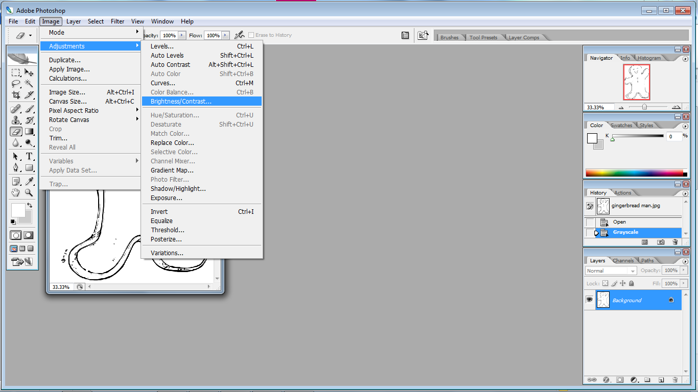
This is where you get to have fun. As I previously mentioned as the start, there is no ONE STEP MAGIC BUTTON!! This is fully customisable to suit you. So there are two methods of changing these values. 1: using the slider 2: using the boxes and inserting values. the way I like to use them is play around with the sliders until you get a grey you are happy with, then either write down in a your art journal the values or take a screen shot using the PRTSC button on your keyboard (or some variation of it) and save the image for later reference. When you go to do your next digi like this, insert these values you have recorder into the boxes. This will allow you to customise a specific grey for you. Now it might take a little bit of time fiddling with the program and printing out different digi's to find the exact grey you like. This is a downside to the no MAGIC BUTTON! but on the upside, you might like or need certain greys slightly darker of lighter depending on what you are printing on, like Kraft paper for example! So have a play and find your settings and RECORD THEM SOMEWHERE!
....And click 'Ok' ... Teehee!!
Now I don't have a screen shot of this you should save your work!! You have already changed it's name, so all you have to do is go to File, and under file press on 'Save'. It should just do it with no boxes opening or anything!

Onto printing!! Once again, go to File, and right down the bottom is 'Print with Preview' select that.

This is the screen it will open up! There are two things we want to do on this page. We want to maximise the usage of our paper, by moving the image out of the center and into a corner, and we want to be able to resize our image for printing.

First we will look at the images position on the page. The section highlighted below is the control for image positioning. If you want to have your image directly in the center of the page leave as is! If not you need to UNTICK the 'Center Image' box. This will allow you to move the image around. Now once again, you can do this two ways, by adding in values or by dragging the previewed image around with your mouse.
If you new the exact location by measurement you needed the image to be on a page you would enter these into the values boxes, and you can change the measurement type to inches, mm ect by the drop down boxes beside them if needed. The picture will automatically move to that location is the preview pane.
If however the exact measurement is not needed, it's just as easy to click on the image in the preview pane and drag it to the position you want it.

You can also choose to type 0, 0 into the value boxes and it will place it in the top left hand corner!

 Resizing can ALSO be done a number of ways!
1: Scale will be set at 100% when you open this print section. You can adjust this by typing in values to any %  and the image will get bigger or smaller. 50% will be half the size, 200% will be twice as big. 
2: 'Scale to Fit Media' - pressing this box the computer will automatically resize your image keeping it's original proportions to the biggest size it can be to fit the page. 
3: Values Box, Height and Width - once again you can add in specific measurements if you have some. You can change the measurements from cm, to inches, to mm. The chain link symbol next to these selections indicate that they are all LOCKED together. when you change one, they will all change to compensate and keep the set proportions of the image!
4. LASTLY!! 'Show Bounding Box' - if this is not ticked you can tick it!! if you want to freely transform the size of your image then place your click and drag on one of the four corners of the preview image! as highlighted in yellow.

Now you can press 'Print'. Pressing Print will bring up your own printers standard print box, which you will hopefully be familiar with. To make sure this prints in greyscale (it should) but you can always select "Greyscale Printing" on your printer page options. :)

Well I hope that wasn't too much information overload!! As I expressed, Photoshop isn't as easy a program to to use (or explain LOL) as Microsoft Word, but once you have done it, it's pretty easy to replicate!

If there is anything in the tute that does not make sense, feel free to comment below and I'll fix it. It's only my second tutorial and I'm still learning!! and on that note, my tummy is grumbling rather loudly!! as i seemed to have worked through lunch. :)

So Have fun formatting and I'll get the next tutorial up after I have given my whinging shoulder a bit of a break from typing. :)

Xo


Wednesday, April 16, 2014

TUTORIAL! How To Tranform A Digi Into Sepia Or GreyTones Using Microsoft Word 2010

The beautiful and talented Pat Frank From 'Cards 2 Cherish' posted this morning a wonderful tutorial on her blog regarding how to format digital stamps using Microsoft Word into sepia colour and pale grey.

Both of these looks can change the tone of your digital stamps from the classic black into something amazing and unique. The brownish tones of Sepia are often suggestive of olden day photos, giving an aged and more neutral appearance, excellent in works where you want a softer look without harsh black line. Where as the palest grey allows for that "no lines" effect which I am always amazed to see and eager to one day learn.

Upon reading Pat's Tutorial I realised that it was a wonderful blog, but it was for an older version of Microsoft Word then I owned. So INSPIRED by Pat, I decided to make my own quick tutorial, using my version to share with you all.

To access the alternate instructions previous created by Pat, please follow the link provided to her blog HERE!!!

TUTORIAL!: Microsoft Word 2010
*Please note: I have not done a tutorial before so BE GENTLE!!! LOL... but also, as some people may never have used Microsoft Word to work with pictures I will start from the very beginning as if you do not know how to use the program at all. Feel free to skip ahead!!*

 Open Microsoft Word 2010. A Blank page will open up with a tool bar across the top. As you can see in the picture provided the tool bar is divided into 8 Main Tabs, and then each of these tabs provide you with individual options. For this project you will need to select with your mouse the Insert Tab, as highlighted in yellow.

Under the Insert Tab are many options most of which we are going to ignore!!! LOL... All you want is the one that says Picture, also highlighted in the image provided.

Pressing the picture button should open up to your computer files. HOPEFULLY!!! :) you have them in some kind of reasonable order, where you can just pick the file you would like to open. :) For todays tutorial I have used Gingerbread Man! by Mo Manning available HERE!!
Once you have selected you file, press Insert.

TAAAADDDDAAAAA!!!!!!! It should come out looking like this. The box around your image allow you to re-size your image!. Just hold your mouse cursor over a corner circle, click the left mouse button, hold and drag to your desired size. This is ONE of the great features of using digital stamps over rubber stamps. The versatility in there use. Using the corners to change the sizes maintains the images original dimensions.

Now that you have re-sized your image...Or not!! it's time to format the image to change those colours. Now when you added your image to the page, Microsoft Word 2010 should have already changed the Main Tabs at the top from the 'Insert' tab, to the 'Format' tab... But if it didn't, or if you have gotten lost along the way, that is what you need to press on now... The 'Format' tab which is the last Main Tab in the row of tabs across the Main toolbar!

Now for the fun part! Most of the option under format we can ignore for now, but Microsoft Word 2010 is a fun program, and you should come back another time and have a play with your images, now you know how to insert a digi and re-size and access the Format Tab in Microsoft Word 2010. For now you need to press on the third icon across 'Colour'. This opens up a drop down box as shown below.

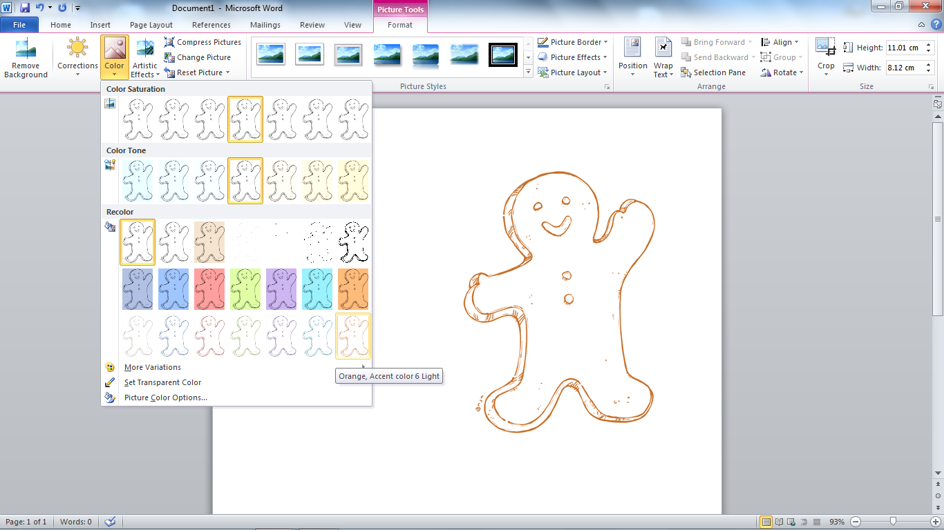
Now I've move my little Gingerbread Man! over so you can see him better! As you move your cursor over the different options in the drop down box you will notice your image change colours as well! See there are three different options to change under Colour... the Colour Saturation, Colour Tone and Recolour. For this Tutorial we ONLY want to change the Recolour Option.
To achieve the palest grey tone for the 'No Lines' technique you need to select the 'Washout' selection. This is the 4th Recolour icon on the top from the left. I have selected it in the photo below but it's a bit hard the see. *sorry, my program chucked a spaz and wouldn't let me highlight it!!*
It is quite pale grey, but is visible when printed out, perfect for No lines!!!

To format your image to sepia choose the last Recolour icon on the bottom right. As you can see in the picture below, once selected the label "Orange, Accent colour 6 Light" comes up. While the label says orange it does appear more brownish than orange when printed, fitting the sepia look. While there is an icon called Sepia (the third from the left) please ignore this icon. This changes the BACKGROUND only!!! and of course we are wanting to change the lines.

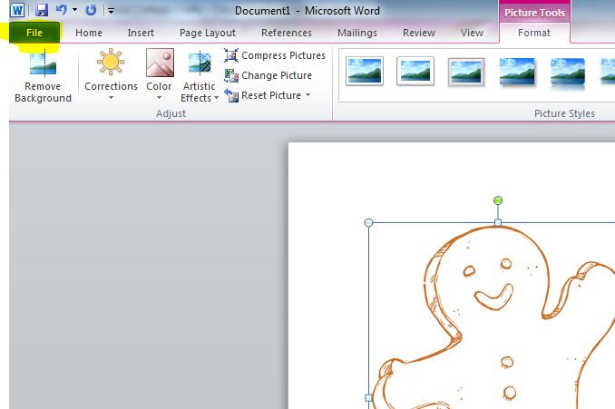
Of course there are many different options under Recolour that you can play around with! Just have fun!! Now that's it for the colouring. Back to basics for a second. To finish this lovely image of course you want to print it!!! To find print, press on the 'File' tab, as highlighted below. *yes I got the Dang thing working again!!*

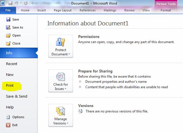
Select 'Print' Tab from the Side Toolbar!!

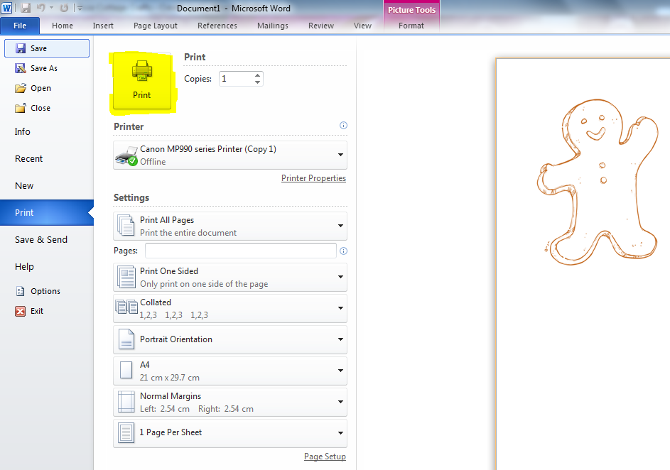
Check over all your printing details! These will be specific to YOUR printer, but the layout should look similar!!! Make sure you leave the options on RGB Colour printing!!! or else all that recolouring you did might just print out in GREYSCALE!!! and press the Print button!!! I've highlighted it below in yellow!!

and last but not least!!!! Check that you have replaced your empty COLOUR INKS!!!! in your printer recently. Or else like me, you'll go through ALL of this effort. to now have to wait till pay day to print it out! :( BIG FAT SAD FACES!!!

LOL

Well I hope this helps you all out!

Once again a BIG thank you to the LOVELY Pat Frank whom inspired this post... If your Microsoft Word is an earlier version, check out her blog instructions HERE!!! and have a look around her blog while your there. She is an amazingly talented woman!!

Thanks for visiting!! and happy formatting!!

Xo

Monday, April 14, 2014

Never Throw Away Your JUNK!!!

Hello Again!!! Haven't seen you in a while!!! *cheeky smiles* Well it seems I started this blog, and realised I had SO MUCH TO SHARE!!! LOL. :)

One thing I learnt really early on and wanted to share was Never Throw Away Your Junk Pieces!! and of course there is a story behind this... as if I share anything without rambling on LOL and because I'm a complete an utter dork, let me share this story to you in a series of photos!!!
                *disclaimer: photos may be of work reproduced for dramatic effect :) to illustrate point of view, but DO reflect exactly what i did on that sad night... well.. except the funny faces and such. they were just added cause I was having fun!!* Teehee

So!!!!

In my very first set of stamp purchase I bought this lovely set of Fairies by Mo Manning called 'Fairy Sweet' Which can be purchased HERE! as a digital set or HERE! as an clear set as seen below.  They are so very gorgeous and I couldn't wait to use them.

Upon Stamping the image I stuffed it the FIRST time...(you'll giggle later at this reference) because I squished to hard on the acrylic stamp, underestimating the power in these muscles *kisses biceps* Teehee! and I smudged the lower legs of this cute little fairy. So I immediately deemed this a muck around piece, which dealt with those 'Fear Of White Spaces" anxieties..., because it was already stuffed, couldn't stuff it anymore, and off I painted!!!  Problem was, when I finished painting the fairy with my Distressed Ink I REALLY loved the colouring, and was really proud of my work, seeing it was now the second image I had painted with inks. So I wracked My brains to come up with a way to use him still on a card. 

So This what I came up with, illustrated here with a blank stamped image, because I didn't take pictures that night! :)  I thought I could maybe cut him into a circle using a die and this would eliminate the worst problem areas by cutting them off. His foot and knee however I wanted to keep the flower and wing that were outside the circle area. Now I had only just received my die cutter machine a few days earlier and had never used dies before. So off to the all knowing, better than Harvard, educational system!!! You Tube!!! LOL

 I followed ALL of the those directions to the letter, I got out my new cutting mat, and new scalpel. Drew around the die with the grey led. Not to hard now, so you can erase it later!! Cut out the little notches, then slid my die back onto the paper, this time with my flower and wing sitting ABOVE the cutting blades. I was CHUFFED! I was so confident this was going to work. Now remember, I'm working with an image I have spent the better of three hours painstakingly painting!! not the blank image you see before you. So I run my die through my machine... I get it out AND!!!


 EPIC FAIL 2!!!
You Tube had failed me!!


PRIVATE PHOTO'S REMOVED DUE TO IDENTITY THEFT
 Followed by lots of tears!!! Because I REALLY had an unusable image NOW!!! and the bit that mad me mad is that I could straight away SEE where I had gone wrong. 
 The circle die doesn't cut from the middle edge like my pencil line, that the YOU TUBE video had told me to do!!! It cuts between the two... and the smart me, the one who went to uni for three years would have practice something like this one a mock stamp, not gone gung ho thinking they knew what they were doing!! But this wasn't my fault!!! IT WAS YOU TUBES!!! LOL


So Like any respectable adult does when things don't go there way... I cracked the poops!! Big Time!! *Disclaimer - did i mention it was 2am by this stage, and tantrums by adults are TOTALLY acceptable at that time Right??* and threw down my fairy and the rest of the stuff I'd been working with to go get me SCISSORS! Cause I was going to chop this little guy to pieces for being the BANE OF MY EXISTANCE... and thats when the little fairy gods intervened on this poor little fairies behalf from being BEHEADED! Looking down at where I had thrown this little guy, ready with my scissors I saw him peeking up at me from the whole made from the die, giving me an an IDEA!!!

PRIVATE PHOTO'S REMOVED DUE TO IDENTITY THEFT
(That's me having an idea!!! Teehee)

And this is where this little card came into being!


So the moral of the story! Don't try and decapitate little fairies! Lol. No, don't throw thing out you think are junk, or you think you have stuffed. With time come perspective and knowledge that you don't have today! and that different point of view may well be just what you need to rescue that piece you thought was junk and make it into something beautiful.

This is now one of my most favorite cards. I can not bare to give it away, he reminds what happens when you believe in a little fairy magic!... and try to murder a fairy!! Teehee!

Xo

The Fear Of White Space!

Today I'm going to share some wisdom I learnt from my extremely wise DAD!! When I started out on that first day at my parents I filled two lovely clean WHITE books, one a sketch book and one a watercolour book with stamps. I spent a whole day with my mum, chatting away stamping two of each stamp, one cop in my watercolour book and one in my sketch book, because I wanted to have a reference book for the colours I used and such and one for my watercolours.
Two weeks later I visited my parents and my dad excitingly asked how my painting was going and if I'd bring around my work to show them both. Now remember, they BOTH paint traditional watercolour, so they were really excited to be sharing there craft with me. I looked at my dad, kinda embarrassed and had to explain that I hadn't done a thing!!!

See every day I would get out my things on the table, so excited to be about to colour! and every day I would start at these CLEAN WHITE SHEETS OF PAPER and an over whelming fear and anxiety would hit me. Fear that I would STUFF IT, that I would RUIN this CLEAN WHITE PAPER and this anxiety would overwhelm me to the point of doing NOTHING!!! I would pick up paint with my brush, go to place it in the sheet and then lift my hand back up and...you guessed it, stare some more. This is what my anxiety ridden art sessions were like. By the end of my time sitting there I was PEED OFF... I would be stomping my feet and slamming around my books and things in an almighty 2 yo tantrum packing things up, mumbling things about "thought art was meant to be peaceful!!" grumble grumble grumble!!!!  yes, we as grown adults can act like toddlers too, especially when we have NO RATIONAL REASON why we are feeling the way we are feeling.

I explained this all to my dad, and he laughed! Which kinda peed me off... but then he explained "The Fear Of White Space", yes there is a thing!! and that it's really common with artist, especially those just starting out. That the anxiety your brain creates over wrecking that WHITE STARK sheet of paper prevents you from starting at all. He explained he had it really bad when he started and his art teacher told him about it. :) He said you just have to remember these important words... "Its Only Paper" , and just make that first stroke, even if it's not exactly what you want, once that first line of colour is done, the fear goes away and you can just move on with having fun.

I think this is one of the most important lessons my dad has given me in painting. Your not painting on GOLD... if you stuff it, it really is JUST PAPER, so relax...have fun...make MISTAKES, cause there will be many and let go of your fear of white space.

Xo


         My Gorgeous Dad! (love the hat daddy LOL) 
PRIVATE PHOTO'S REMOVED DUE TO IDENTITY THEFT


  My Gorgeous Mum.... and me!!
PRIVATE PHOTO'S REMOVED DUE TO IDENTITY THEFT

Sunday, April 13, 2014

The Learning Process - My First Attempts...

When you're starting out in any new skill it's so tempting to look at the work you have done, your first pieces and instantly want to BIN THEM!!! They probably won't be great, they WILL have flaws, and there will be MANY things about them that you don't like. But!!! I think it's really important for you to keep these precious memories of where you started...Everything has a beginning, and this is where yours was. We should never seek to erase memories, even ones we aren't happy about...because they often led to knowledge and progress... and they are BLOOMING FUNNY to look back on later on when you REALLY know what your doing!!! I found this to be true when I was following some online groups through facebook and the subject arose.

I spend quite a lot of time on online groups through facebook. Being unable to leave the house as often as I used to means I had to find a new way to "socialise" then I previously did...a way that didn't involve me bugging the bajeebers out of my parents constantly!!! and so I found not only a few support groups online for my vestibular disorder but a few groups specifically about colouring with stamps!!!

Two of my FAVORITE groups being Kit and Clowder, run by an amazing Aussie girl called Alyce and a Mo Manning Fan Club called Bella and Bronte's Clubhouse. Now while a fan club might SOUND cheesy, this fan club has been one of the most AWESOME things I have come across since starting my stamping and allows me to speak and interact DIRECTLY!!!! with Maurie Manning, the artist who designs these gorgeous stamps I love so much and get her advice and wisdom and!!!!! yep... I have a total lady crush on this women's capabilities!!! LOL but honestly, spend enough time looking at her work, and you will too... anyhoo, I digress!

It was on Kit and Clowder that the discussion of starting out came up and what our first pieces were like and how far we have come. Seeing I'm only very new to this, I was happy to share pictures of my first pieces and thought thats where I'd start here.

My Very First Stamp - using Watercolour
Stamp Name: "Swiss Pixie Heidi with Ornament" by C.C Designs
(Big Thank you to Tindaloo for telling me the stamp name!)


 My Second Water Coloured Stamp! Soooo Much Better. :)
Stamp Name: " Wee Love You Bunches " designed by Sylvia Zet © Wee Stamps for Whimsy Stamps


My First Hand Drawn Water Colour! LOL


 My First Distressed Ink Stamp!......Stamp Name: "You Are A Peach" Designed by Maurie Manning, Rubber Stamp by Penny Black.


            and The Card I Made Her Into!


 My First Copic Coloured Image.
 Stamp Name: "Little Elf Fin" Designed by Maurie Manning, Rubber Stamp by Penny Black.


So There you go...All My Funny Firsts!

It's sooooo easy to throw these out for the "mistakes" you have made. but it's better to put them away somewhere safe, to give you giggles later on, and show you how REALLY far you have truly come in your learning.

Xo