
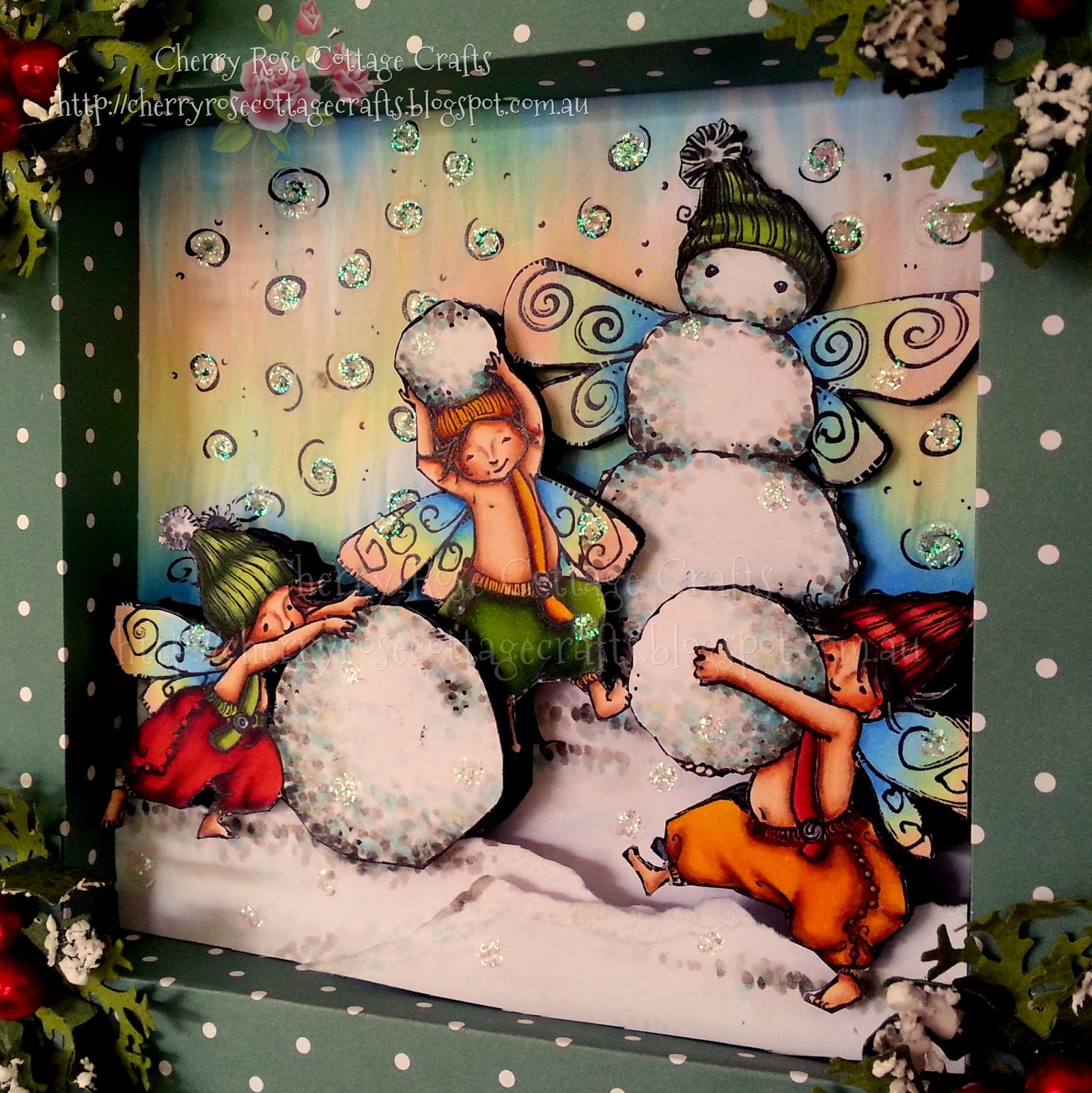
Hi there! I thought I'd quickly share with you all the way in which I put together the background for my latest Shadow Box Creation the "Fairy Christmas".
Basically I just went and had some fun with my Copics!! but was smart enough to take photos along the way!! LOL. So if you like the effect, it's pretty simple to do!! Feel free to use this tutorial to create your own unique works and if you happen to give a little credit/linking to my blog when you post your creations, that would truly be LOVELY of you!!! ;)
So I started with a gorgeous scene of Snowmen Fairies I merged together from the "Fairy Christmas" set and the coordinating "Snowman Fairy" all available on Mo Digital Pencil. I used Adobe Photoshop CS2 to do this and if your interested in using this program and learning how to do merging on scenes the program is available legally as freeware HERE and I originally learnt how to merge following along with this wonderful You Tube Video!
You'll Need the Following Copics:
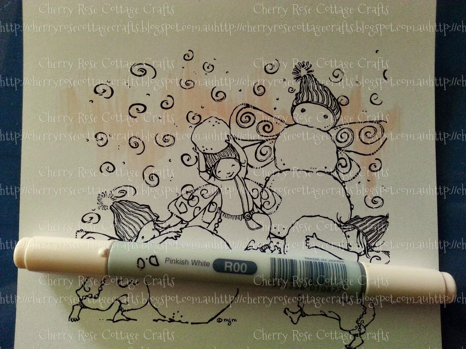
R00, Y00, B12 + B00
Start by randomly flicking R00 across your page. try thinking about how Northern lights kind of flicker across the sky. The more random the better, and really try and flick out the edges so that they are not solid . I do this by starting my stroke in the middle of the colour band and flicking outwards towards the edges in whatever direction I'm going so the tail of the flick ends up being lighter then where I started, much like a tick!
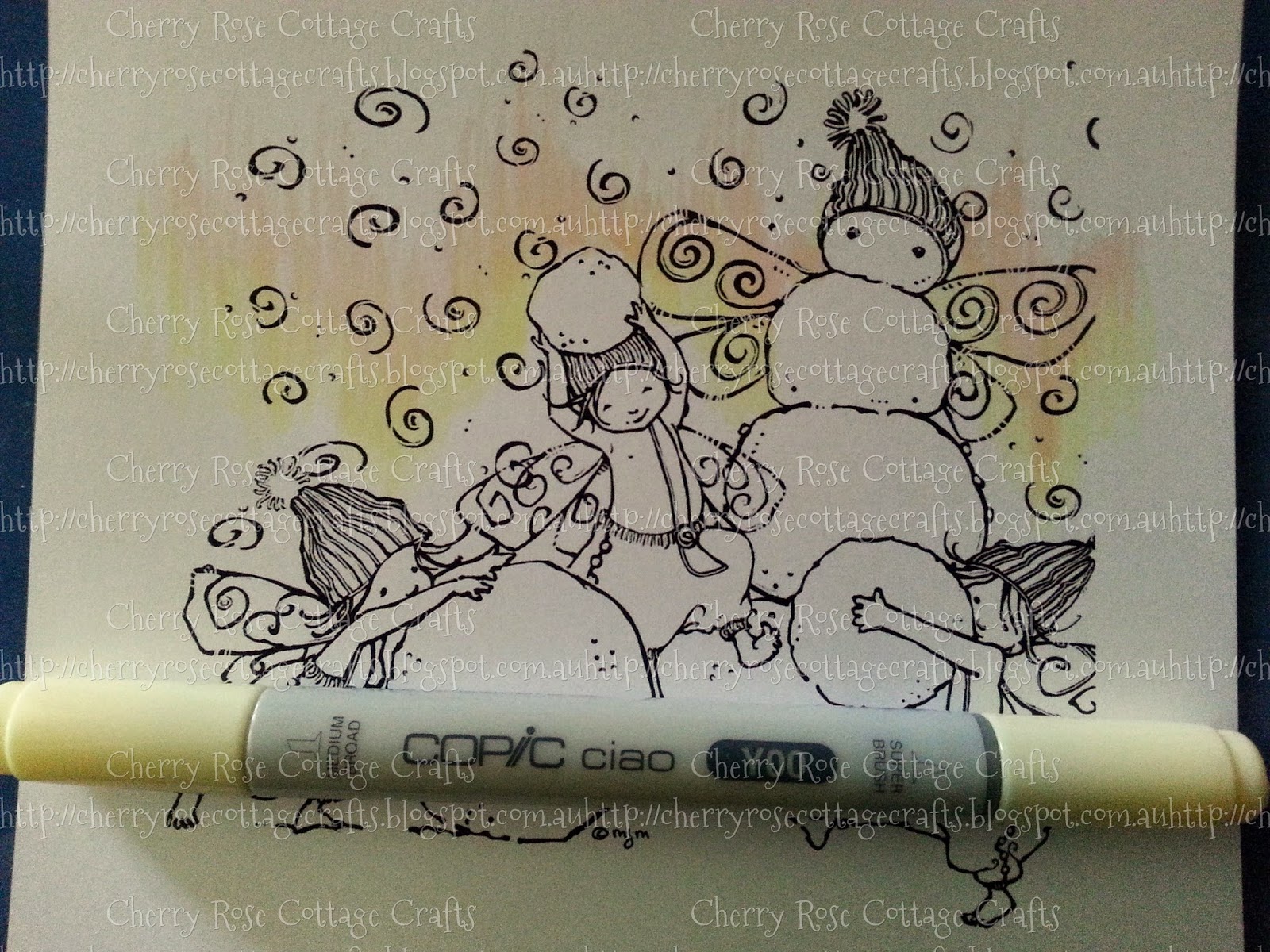
Next add the Y00. I choose to add it towards the bottom of my R00, but I also overlapped the R00 slightly, this overlapping is important because it gives you the mixed tones of orange between the Yellow and Pink.
Now taking your B12, flick in from the outer edges, tops and bottoms. This will form your sky line, so make sure that it forms a solid colour line across the top and bottom, but then to allow for effect of the Northern Lights, you can randomly drop the colour down as seen below. Make sure your Marker colour is strongest this time from the outer, and lightest towards the inner this time.. so Flick TOWARDS the center, not away! Leave a gap of white because you have one more blue, just lighter.
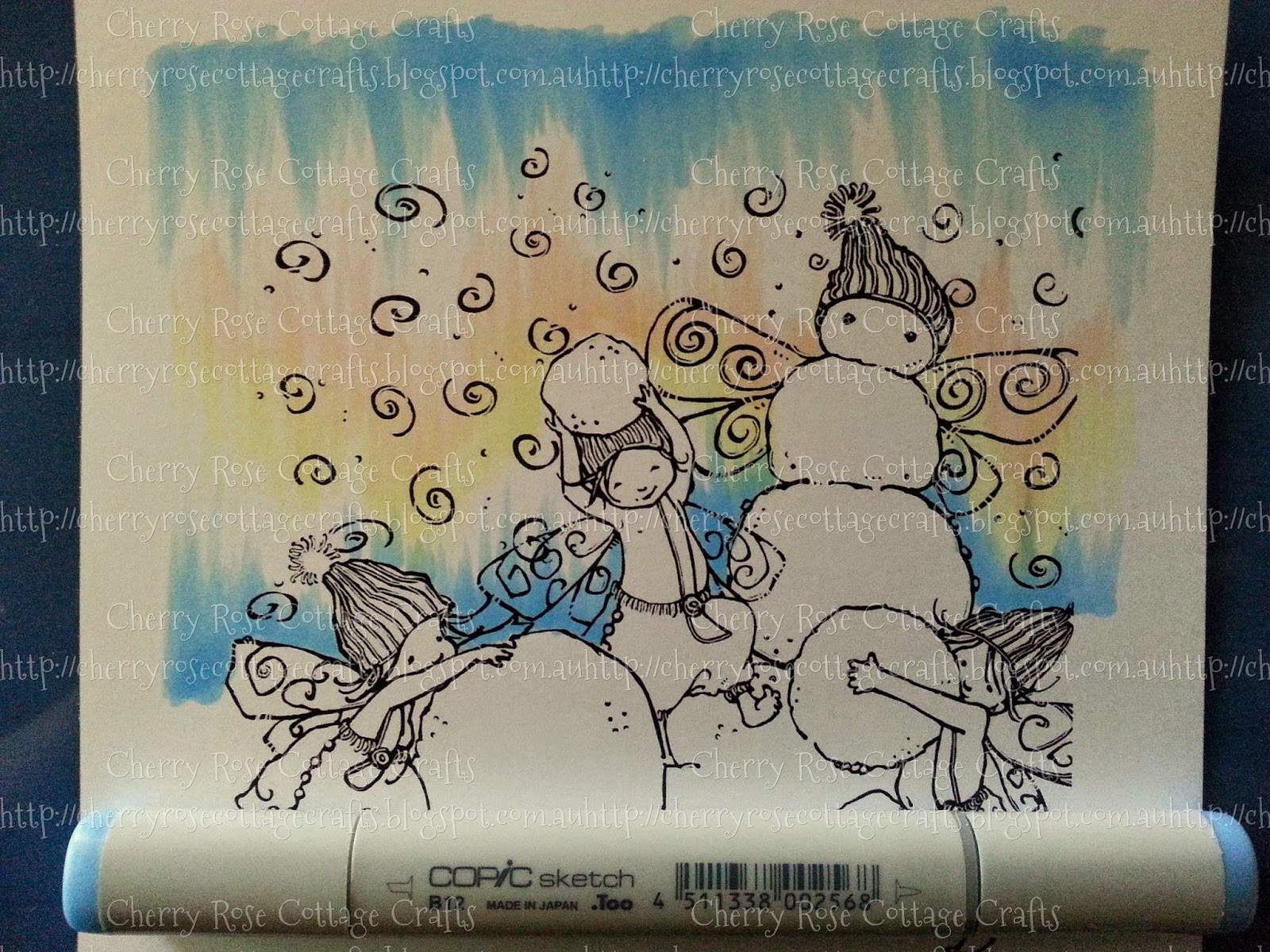
Taking your B00 now flick over the top of the B12 into the white and occasionally into the R00 and UP from the bottom into the Y00.
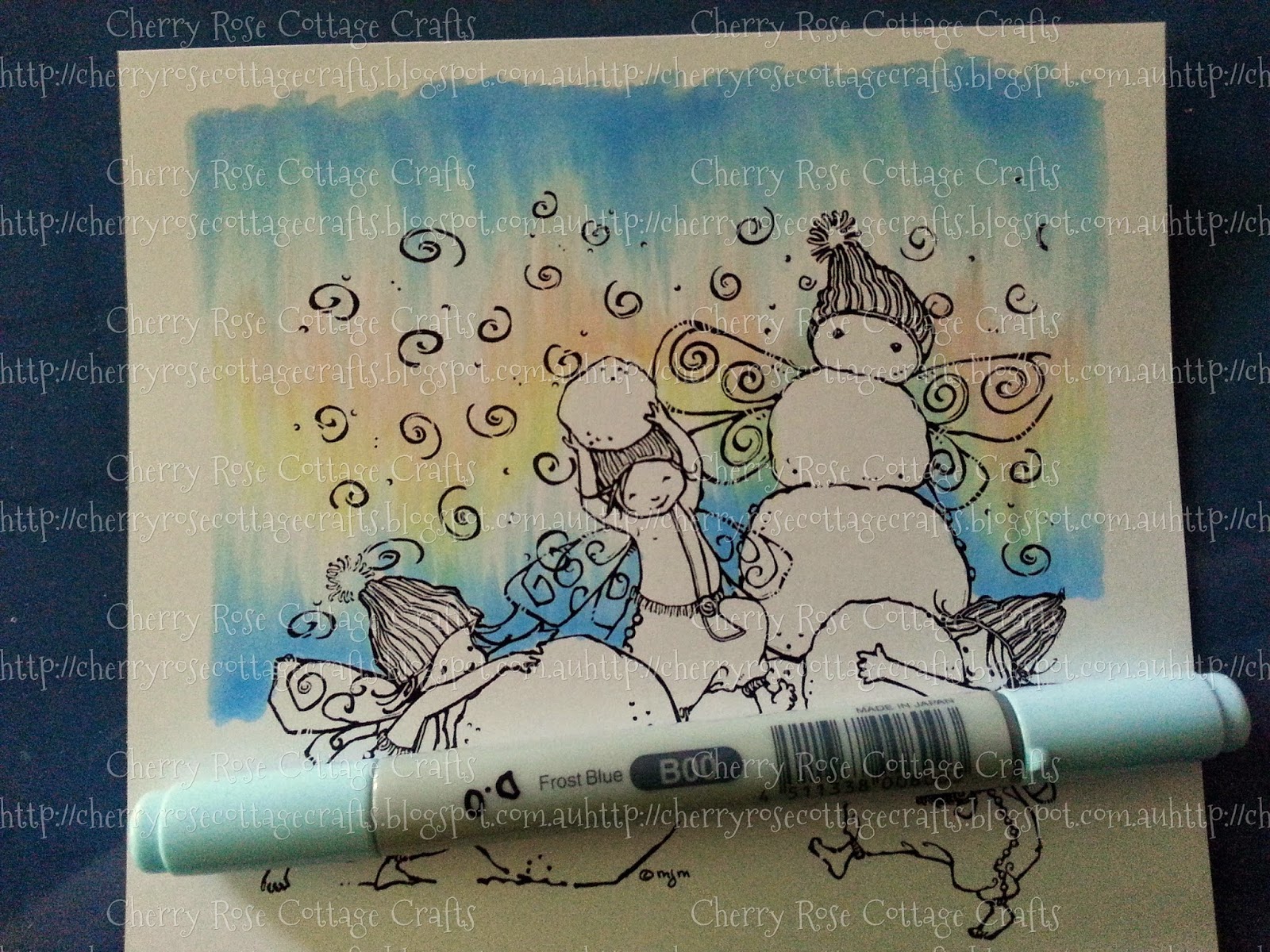
Going back with the R00, flick back over your background, darkening your "Lights" until you are satisfied with the colour.
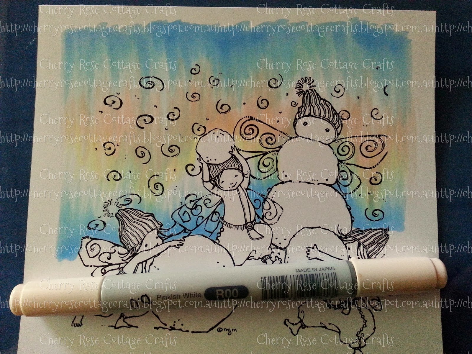
Lastly, taking the Y00, Colour back over the top. This last time you can take the route of your colour slightly different then the originally placed Y00, more randomly and crosswise to the R00, also extending up and into the B12 a little. This allow the Yellow to blend with the colours underneath creating subtle elements of orange and green through your background, which is more in line with the real Northern Lights.
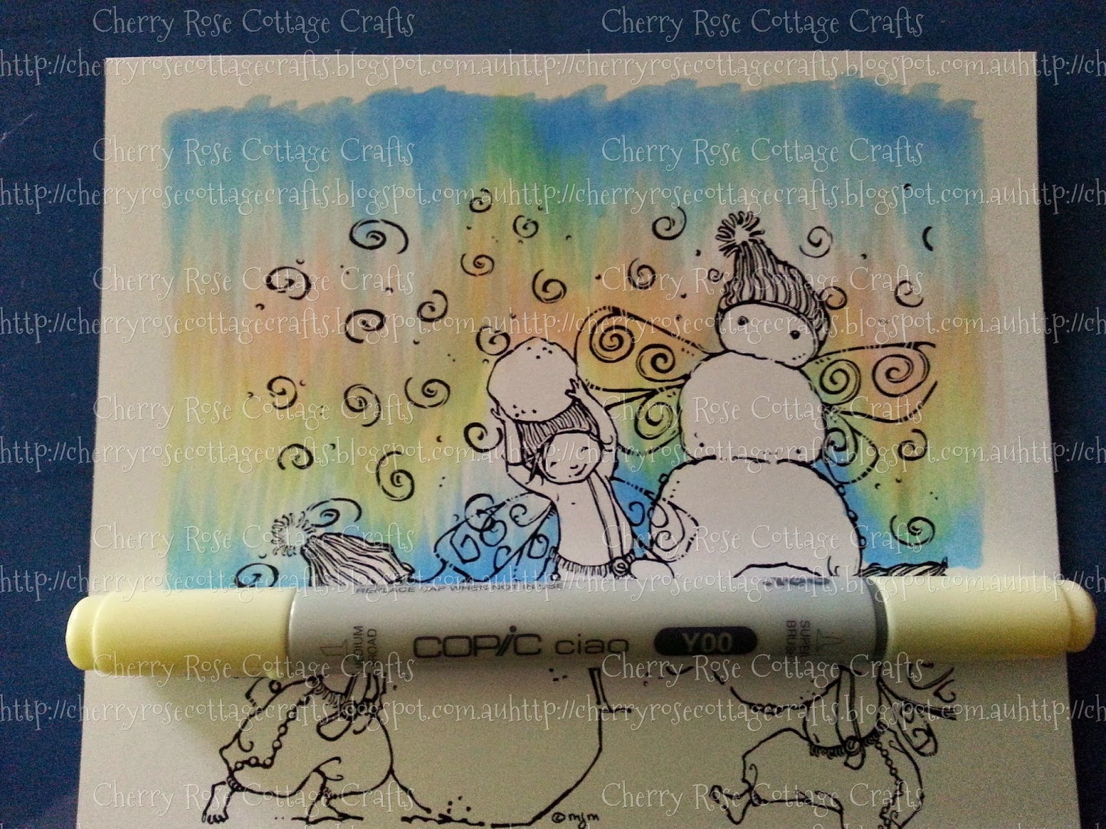
The below image has been cropped To only use part of the sky background, but I think it looks quite effective.
Just remember to have FUN!!. Try out different colours and just see what happens!
Happy Crafting!! Xo
Fabulous effect and tutorial. Thank you x Ironically I've just done something similar on a Christmas bauble which I'll be posting on my blog tomorrow for a DT project. However I love the effect you've create much better. X
ReplyDeleteThanks. It really is such a simple way of doing a very effective background, and can be done in so many different colours and styles. :)
DeleteHUGS! Amanda
Great tutorial, and thank you so much! It is a great effect! Don't use copics but use spectrum noir, but I am sure I can work out equivalents myself to get this lovely effect! xx
ReplyDeleteThanks Kazzie. Yes I'm sure you will find Spect Noir Equivalents. It's all just about having fun. I wasn't sure if it would work out when I started, but as my Dad says (he's an artist, does traditional watercolour painting) ITS ONLY PAPER!!... So the worst that happens is you stuff it up and it doesn't turn out right, and then I reserve that piece of colour BLOB for punched hearts or stars!!
Delete:) Amanda
wow amazing! Its great to see pics of the process, it looks very different than what you would expect. If I had tried without seeing the process I wouldn't have thought I was doing it right. Thanks so much for this! It is a fabulous work of art. TFS, Lizzy
ReplyDeleteThanks Liz. Yes, it turned out a heap different then what I thought it would look, the colours just blended and settled and I thought YEP!! I LOVE THAT!! LOL. I was so glad I have learnt to photo graph and take notes of what I do along the way so I can replicate this (because of my illness my memory is short term memory is shocking, so photos and notes help me get by).. but it also lets me do Tutes of things that work!! :). I cannot wait to see what other people do with this now! :) I also used the same colour combo with the fairy wings.. just added a little B14 in the darkest shadows. seemed only fitting.. I now love this colour combo so much I think I will be using it so much more.. it's very Gelato Icecream!! :) LOL..
DeleteHUGS!! Amanda
The colors are SO pretty. I wish I would have read your blog before I did my wings. Your creation is beautiful.
ReplyDelete